Crypto Checkout UX: How to Reduce Cart Abandonment for Crypto Payments (2026)
Crypto checkout abandonment rates exceed 85% on most e-commerce stores — far higher than the 70% average for credit card checkout. The difference is not customer intent. It is UX friction. Network selection confusion, unclear payment timers, missing QR codes, and poor mobile layouts drive away buyers who entered checkout ready to pay. Fixing these problems can cut your crypto abandonment rate in half.
You have already done the hard part — convincing a customer to choose crypto at checkout. They clicked the button, they selected their currency, and they are ready to send funds. What happens in the next 60 seconds determines whether you get paid or lose the sale. This guide covers the specific UX improvements that high-converting crypto checkouts share, and how to implement them on your Shopify or WooCommerce store.
Why Crypto Checkout Abandonment Is So High
The Knowledge Gap
Most crypto-paying customers are comfortable with wallets and transactions. But e-commerce crypto checkout introduces decisions they do not face when sending crypto to a friend or an exchange. Which network should I use? Is the payment amount in USD or in tokens? How long do I have to complete the transfer? What happens if I send from the wrong chain?
Every unanswered question is an abandonment trigger. A customer who hesitates for 10 seconds about network selection is a customer who might close the tab. The job of your checkout UX is to eliminate hesitation — not by removing options, but by making the right choice obvious at every step.
Time Pressure Without Guidance
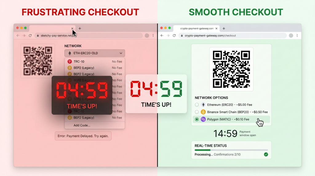
Crypto payment pages typically include an expiration timer — usually 15 to 30 minutes — because the exchange rate between fiat and crypto fluctuates. The timer creates urgency, which is good for conversion. But urgency without clarity creates panic. A customer who sees a 15-minute countdown but is unsure which network to select, or who needs to switch wallets, feels rushed rather than motivated. They abandon rather than risk making a mistake.
Mobile Wallet Friction
Over 60% of e-commerce traffic comes from mobile devices. On desktop, a customer can scan a QR code from their phone wallet while viewing the payment page on their computer screen. On mobile, this workflow breaks — the customer is already on their phone and cannot simultaneously display a QR code and scan it. Mobile checkout needs a different flow: a deep link or copy-paste workflow that lets the customer send the payment without leaving their browser.
The High-Converting Crypto Checkout: Element by Element
Clear Payment Amount Display
Show both the fiat amount and the crypto amount prominently. A payment page that displays only “0.00342 BTC” forces the customer to do mental math to verify the amount is correct. Display “0.00342 BTC ($285.00 USD)” so the customer can instantly confirm the number matches their order total. This single change reduces “did I get this right?” hesitation that causes abandonment.
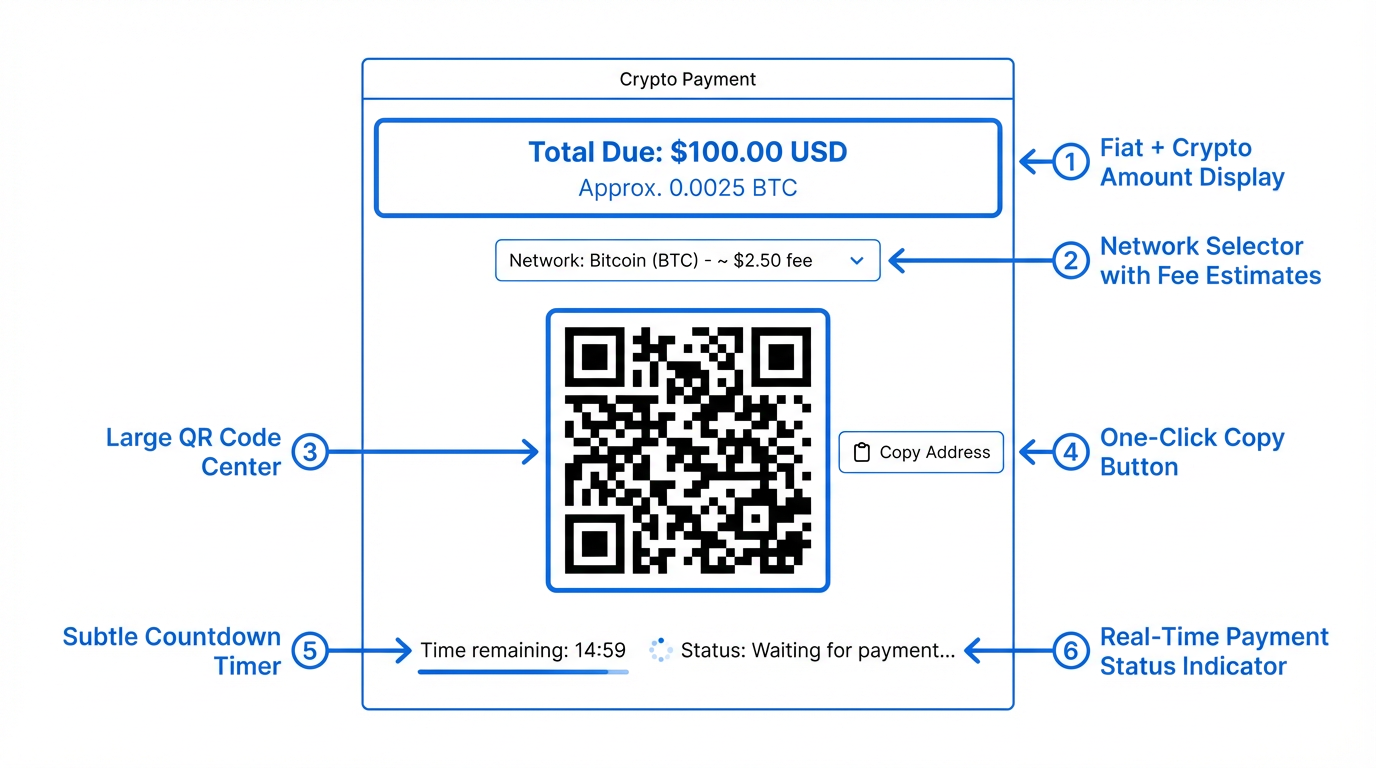
Place the fiat amount first and larger than the crypto amount. Your customer thinks in dollars (or their local currency), not in satoshis. The crypto amount is an execution detail — the fiat amount is the trust anchor.
Network Selection with Guidance
If your gateway supports multiple networks (and it should — see our USDC network comparison guide), present network options with context that helps the customer choose. Do not just list “Ethereum,” “Polygon,” “Tron” with no additional information. Instead, show estimated fees and confirmation times for each option:
- Polygon — Fee: ~$0.01 · Confirms in ~2 sec
- Tron (TRC-20) — Fee: ~$0.30 · Confirms in ~3 sec
- Ethereum — Fee: ~$2.50 · Confirms in ~15 min
This format lets the customer make an informed choice in seconds. Most will choose the cheapest option, which is the right outcome — low network fees improve their experience and reduce the chance they abandon over an unexpectedly high total cost.
Pre-select the lowest-fee network as the default. A customer who does not care about network selection gets the best experience automatically. A customer who prefers a specific chain can switch with one click.
QR Code and Copy Address
Every crypto payment page needs two things: a QR code that encodes the wallet address (and ideally the amount and network), and a one-click copy button for the address. These are not optional — they are the two primary ways customers initiate a payment.
Desktop customers scan the QR code with their mobile wallet app. Mobile customers tap the copy button, switch to their wallet app, paste the address, and confirm the transaction. Both flows should be tested and optimized.
The QR code should be large enough to scan quickly — at least 200×200 pixels on desktop, scaling appropriately on mobile. Place it above the fold so the customer does not need to scroll to find it. Include the wallet address in plain text below the QR code as a fallback.
Payment Timer Design
The payment expiration timer serves a legitimate purpose — it prevents exchange rate drift between when the customer initiates checkout and when they send funds. But the timer’s design significantly impacts conversion.
Use a long enough window. 15 minutes is tight for a customer who needs to open their wallet app, select the right network, and confirm the transaction. 20 to 30 minutes gives comfortable margin without excessive exchange rate risk. Aurpay’s payment pages default to a reasonable expiration window that balances these concerns.
Show the timer clearly but not alarmingly. A large red countdown creates anxiety. A subtle timer in the corner with a note (“This rate is locked for 20 minutes”) communicates urgency without panic. Change the timer color to yellow at the 5-minute mark and red at 2 minutes — progressive urgency that matches the actual risk level.
Offer easy refresh. If the timer expires before the customer completes payment, do not force them back to the cart. Offer a one-click “refresh payment” button that recalculates the amount at the current rate and resets the timer. The customer’s intent has not changed — they just needed more time.
Real-Time Payment Status
Once the customer sends their transaction, the payment page should update in real time. Show three states clearly:
- Waiting for payment — The default state. Display wallet address, QR code, and amount.
- Payment detected — The transaction has been broadcast to the blockchain but not yet confirmed. Show a “Payment received — confirming…” message with a spinner or progress indicator. This state is critical — it tells the customer they can close the page or return to the store.
- Payment confirmed — The required number of blockchain confirmations have been reached. Display a success message and redirect to the order confirmation page.
The transition from “waiting” to “detected” is the highest-anxiety moment for the customer. They have sent their crypto and are waiting to see if it registered. A payment page that detects incoming transactions within seconds and updates the status immediately builds trust and prevents the customer from sending a duplicate payment.
Mobile-Specific Optimizations
Deep Links to Wallet Apps
On mobile, a QR code is useless — the customer cannot scan their own screen. Instead, implement deep links that open the customer’s installed wallet app with the payment details pre-filled. A “Pay with MetaMask” or “Open in Trust Wallet” button that launches the wallet app directly is the mobile equivalent of scanning a QR code on desktop.
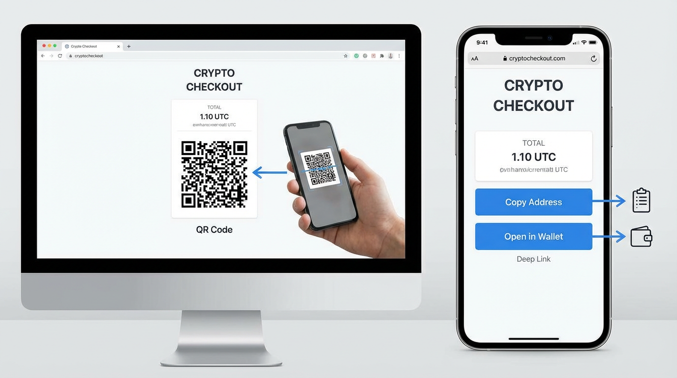
If deep linking is not available for all wallet apps, make the copy-address button large and prominently placed on mobile. The customer’s workflow becomes: tap copy → switch to wallet app → paste address → enter amount → confirm. Each extra tap is friction, so minimize the steps your checkout adds to this sequence.
Responsive Payment Page Layout
The payment page layout should adapt to mobile screens. Key adjustments:
- Stack the payment amount, QR code, and address vertically (no side-by-side layout)
- Make the copy button full-width and at least 48px tall for easy tapping
- Place the network selector above the QR code, not below it
- Ensure the payment status indicator is visible without scrolling
Test your crypto checkout on both iOS and Android devices. Wallet app behavior differs between platforms, and a checkout that works perfectly on desktop Safari may have layout issues on mobile Chrome or in-app browsers.
Trust Signals That Reduce Abandonment
Show Which Currencies and Networks You Accept
Display supported currencies and networks on your product pages and in your footer — not just on the checkout page. A customer who sees “We accept BTC, ETH, USDT, USDC” alongside Visa and Mastercard logos knows the option exists before they reach checkout. This pre-checkout awareness reduces surprise and friction at the payment step.
Non-Custodial Badge
If you use a non-custodial payment gateway, communicate this clearly. “Payments go directly to our wallet — we never hold your crypto” is a trust signal for crypto-native customers who are wary of custodial intermediaries. This is especially important after high-profile collapses of custodial services — customers who have lost funds to custodial gateway failures actively look for non-custodial alternatives.
Transaction Transparency
After payment confirmation, show the customer the blockchain transaction hash with a link to a block explorer (Etherscan, Tronscan, Polygonscan). This proves the payment was received and provides an independent verification mechanism. Crypto-native customers expect this level of transparency — it is the blockchain equivalent of a payment receipt.
Measuring Checkout Performance
Track these metrics to identify and fix crypto checkout friction points:
Crypto checkout initiation rate. What percentage of customers who see the crypto payment option click on it? Low initiation rates suggest the option is not visible enough or not clearly labeled. A/B test the button text and placement.
Network selection drop-off. How many customers who reach the network selection step abandon before choosing? High drop-off here indicates confusion — add fee and speed indicators to each network option.
Payment page to payment sent conversion. What percentage of customers who see the payment page actually send crypto? Low conversion means the payment page itself is the friction point — check the QR code visibility, amount display, and mobile layout.
Time from page load to payment detection. How long does the average customer take between seeing the payment page and sending their transaction? Long times (more than 5 minutes) suggest the customer is struggling with the process. Short times (under 2 minutes) indicate a smooth flow.
Duplicate payment rate. How often do customers accidentally send the same payment twice? High duplicate rates indicate the “payment detected” state is not updating fast enough or is not visible enough. Fix the real-time status display.
Quick Wins: Changes You Can Make Today
If you already accept crypto on your Shopify or WooCommerce store, these changes can improve your conversion rate immediately:
- Add fee estimates to network selection. Show “~$0.01 fee” next to Polygon and “~$2 fee” next to Ethereum. Customers choose faster when they see the cost.
- Pre-select the lowest-fee network. Default to Polygon or TRC-20 instead of ERC-20. The majority of customers will accept the default.
- Display both fiat and crypto amounts. “$150.00 (0.00178 BTC)” is clearer than “0.00178 BTC” alone.
- Enlarge the QR code. At least 200x200px on desktop. Smaller QR codes cause scanning failures.
- Add a “copy address” button on mobile. Make it full-width and visually prominent — this is the primary mobile payment action.
- Show “Payment detected” within seconds. Real-time transaction monitoring keeps the customer on the page instead of refreshing or resending.
Build a Checkout That Converts
The difference between a 15% and a 50% crypto checkout conversion rate is not the payment technology — it is the UX layer on top of it. Clear amount display, guided network selection, responsive mobile design, real-time status updates, and appropriate trust signals turn a crypto payment page from a technical form into a frictionless buying experience.
Aurpay’s checkout pages are designed with these UX principles built in — real-time payment detection, multi-network QR codes, responsive mobile layout, and clear status indicators. Available as a native app on Shopify and a plugin for WooCommerce, with 0.8% processing fees and support for BTC, ETH, USDT, USDC, and 10+ cryptocurrencies. Compare Aurpay’s checkout experience against other gateways and see the difference UX makes.